A navigational indicator will slide rather than abruptly transitioning in between each tap or click. This enables the user to visually track and understand where they are within an extensive list of navigational items while giving a visual queue as to where they will be taken to next.

By adding motion to a simple icon, users cognitively understand the action and subsequent motions of an otherwise basic drop-down menu on a mobile device
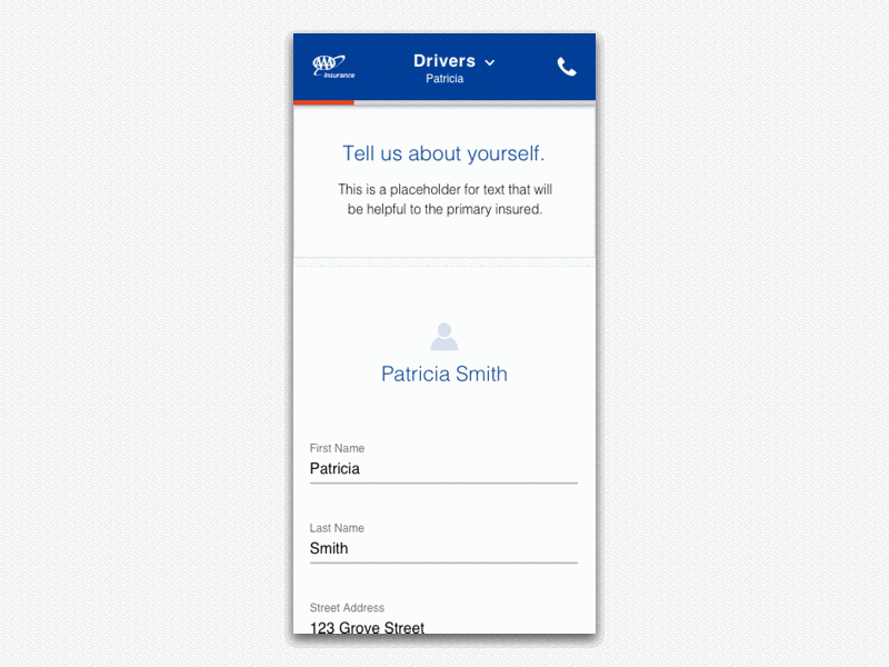
Taking at another look at a mobile example, when a user taps to the next portion of a flow, the next interface slides in from the right while the red progress bar allows the user to understand that they are closer to completion. When this sequence of visual queues occur, user tendency suggests that they are more apt to stay engaged in the flow which may reduce the number of drop-offs.

With the advent of rapid prototyping tools, designs are handed off with visual examples along with the details of the timing for each interaction. This enables more efficient deployment cycles by reducing the number of iterations between builds and design validation.